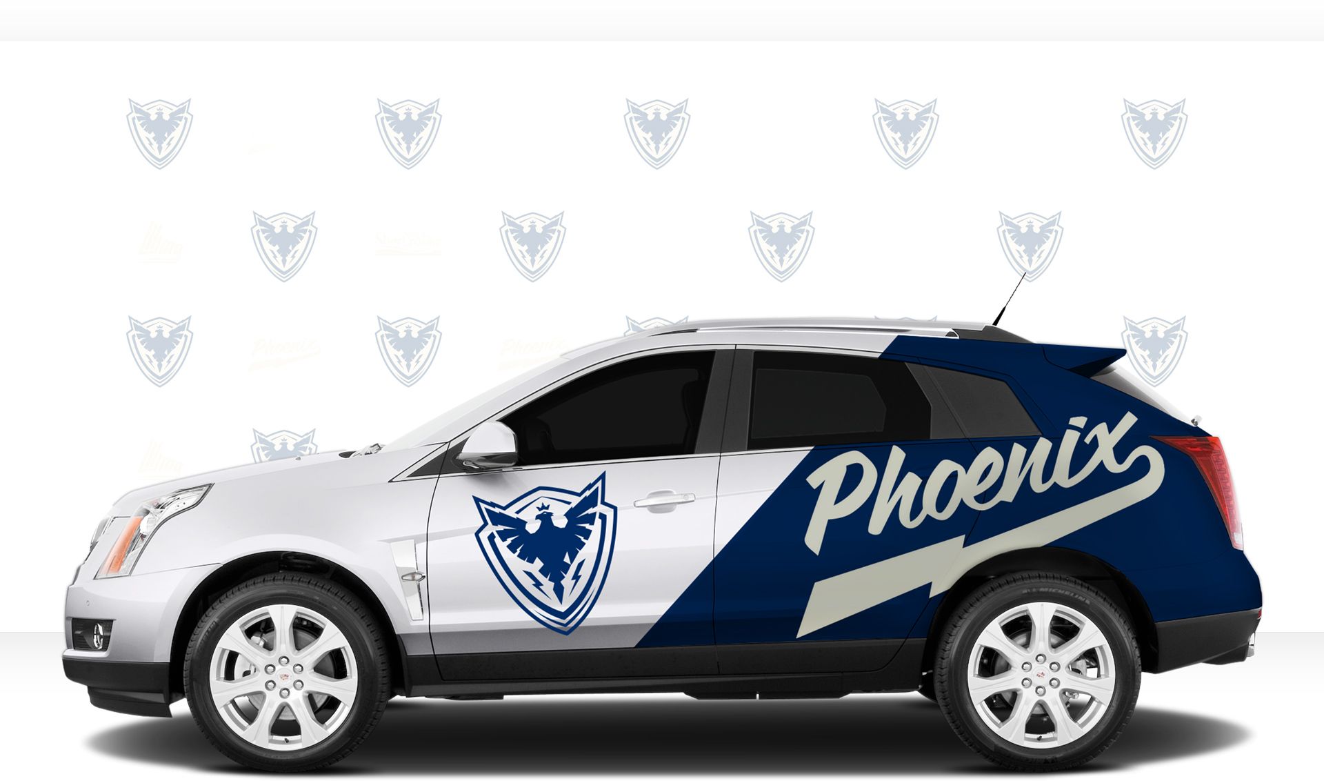
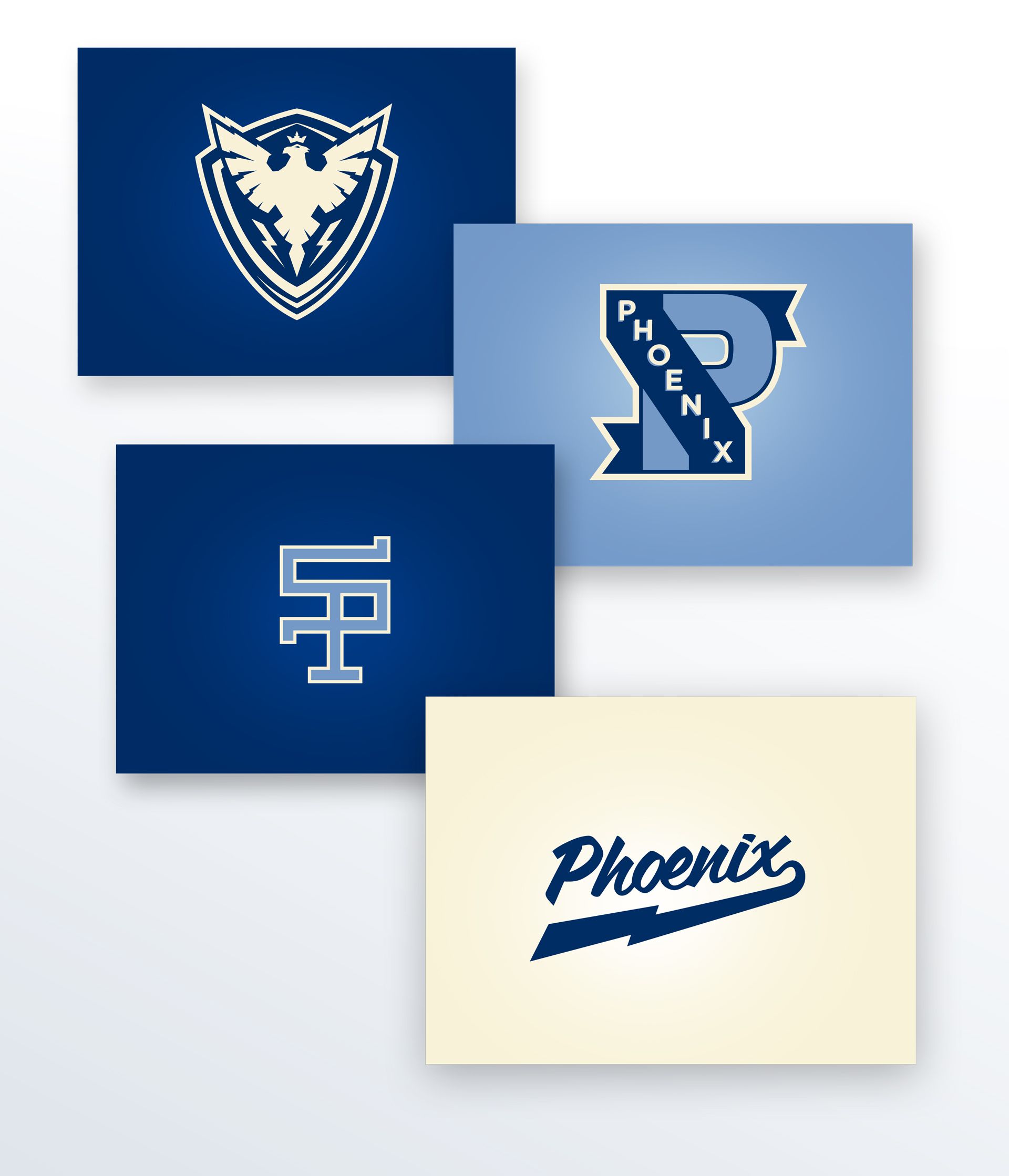
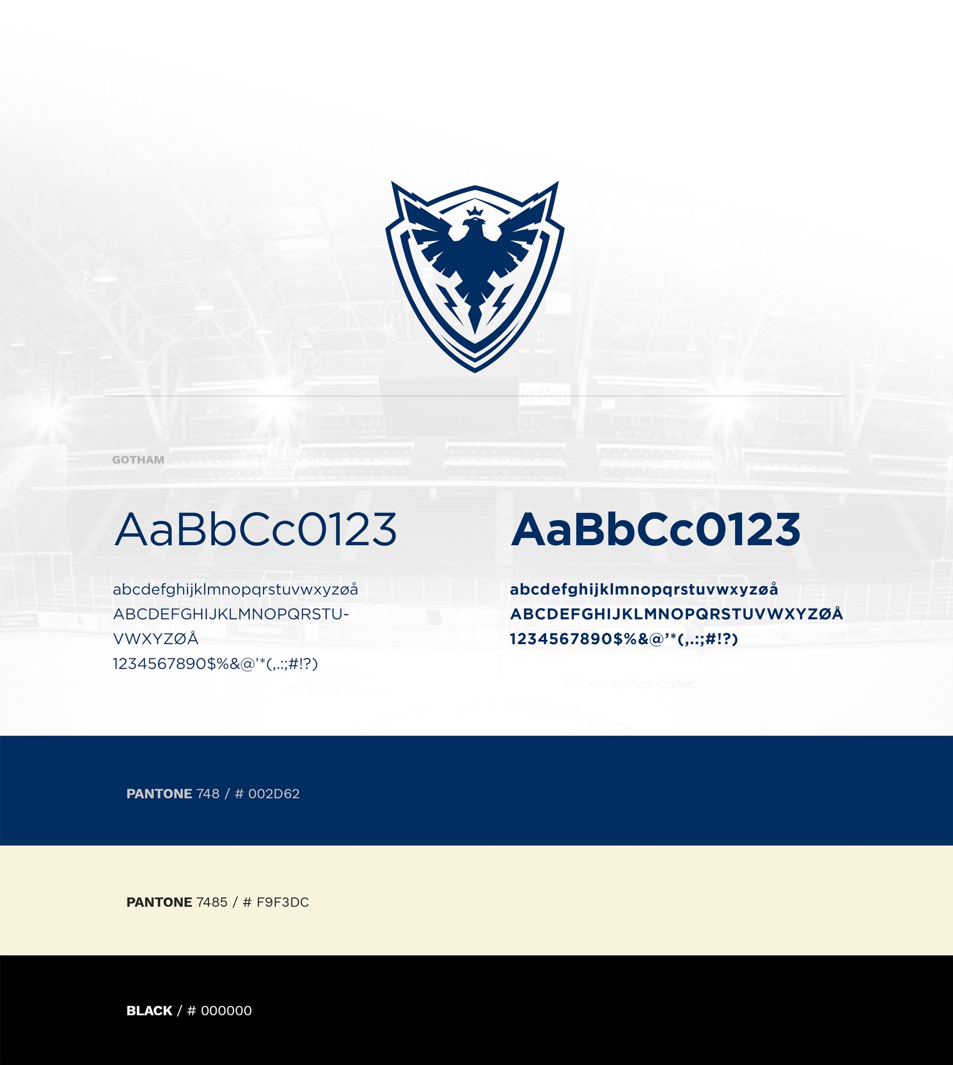
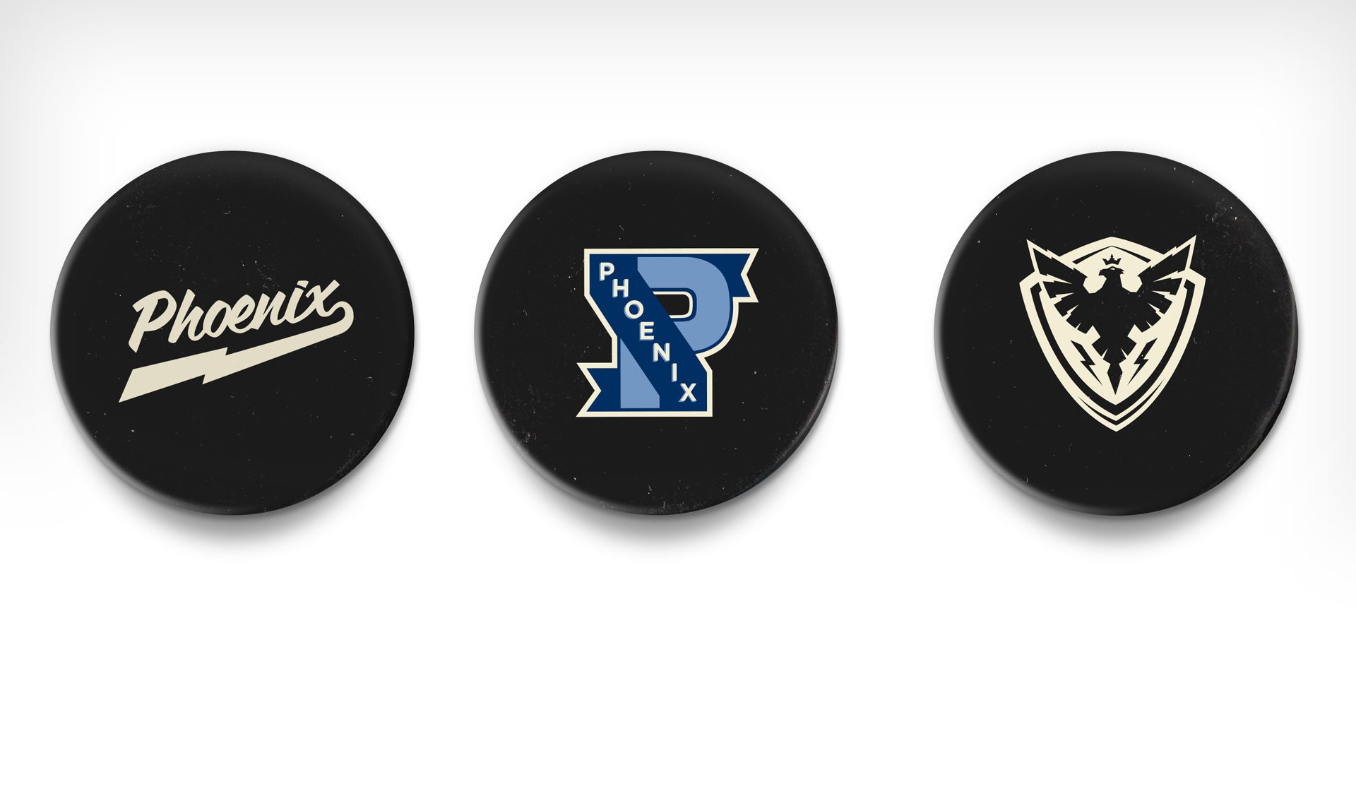
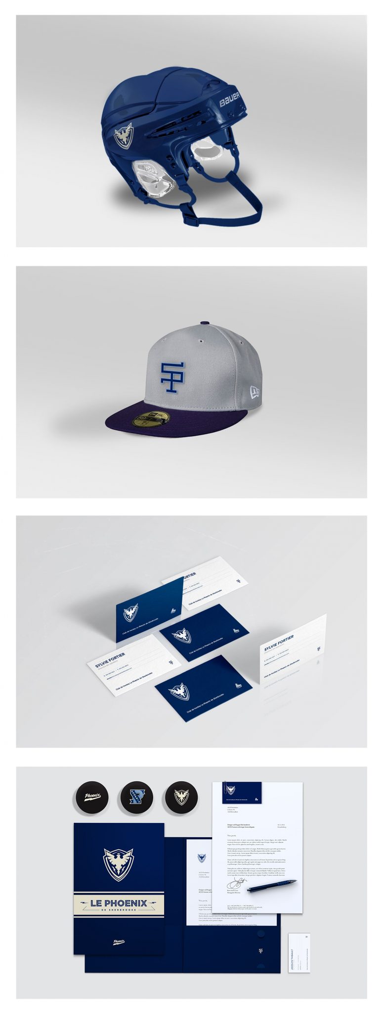
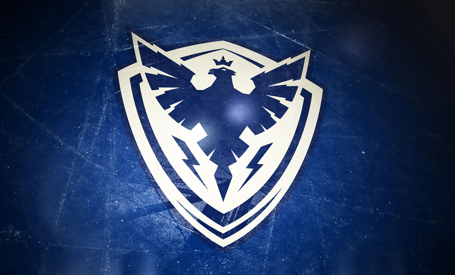
Le Phœnix

Graphic Design

Equip the new QMJHL expansion team with a strong branding that would stand out. This is the mandate entrusted to Beauvoir by the shareholders of the Sherbrooke franchise, with only one condition: the name chosen by the population… The Phœnix!

No. 12 in the top 50 jerseys of all-time – According to The Hockey News

A hockey team for and by Sherbrooke people

The most important thing for the team was to create an identity that citizens would find appealing on the long run and be proud to wear. Everything was conceived so that this image stands the test of time while being easy to adapt for derived products.

Beyond the logo: A well-rounded identity

After having created the Phoenix identity displaying its corporate colors of blue and cream, we have developed secondary and tertiary logos, common practice in the sport world. This allowed us to offer the team a much more complete and versatile identity.

Scroll to see the nextProject